UX Burger Responsive Website

The order process made simple.

Overview

Making food orders quick and easy so that you can spend more time doing what you love.

Problem

Most restaurant websites are clunky to navigate and take too many clicks to order thanks to:

  • Inefficient user flow
  • Upsell pop-ups
  • Sign up screens

Solution

Design a responsive website that addresses the user needs:

  • Clear, intuitive navigation
  • Streamline the order process, eliminating any needless screens or clicks.
  • Allow users to order for themselves and others at the same time by adding a “split bill” feature.

Role

UX/UI Designer

Who are the Users?

1) Who is the type of person that would order takeout from a restaurant?

2) Is the problem we are solving relevant to the “once in a while” customer or the regular?

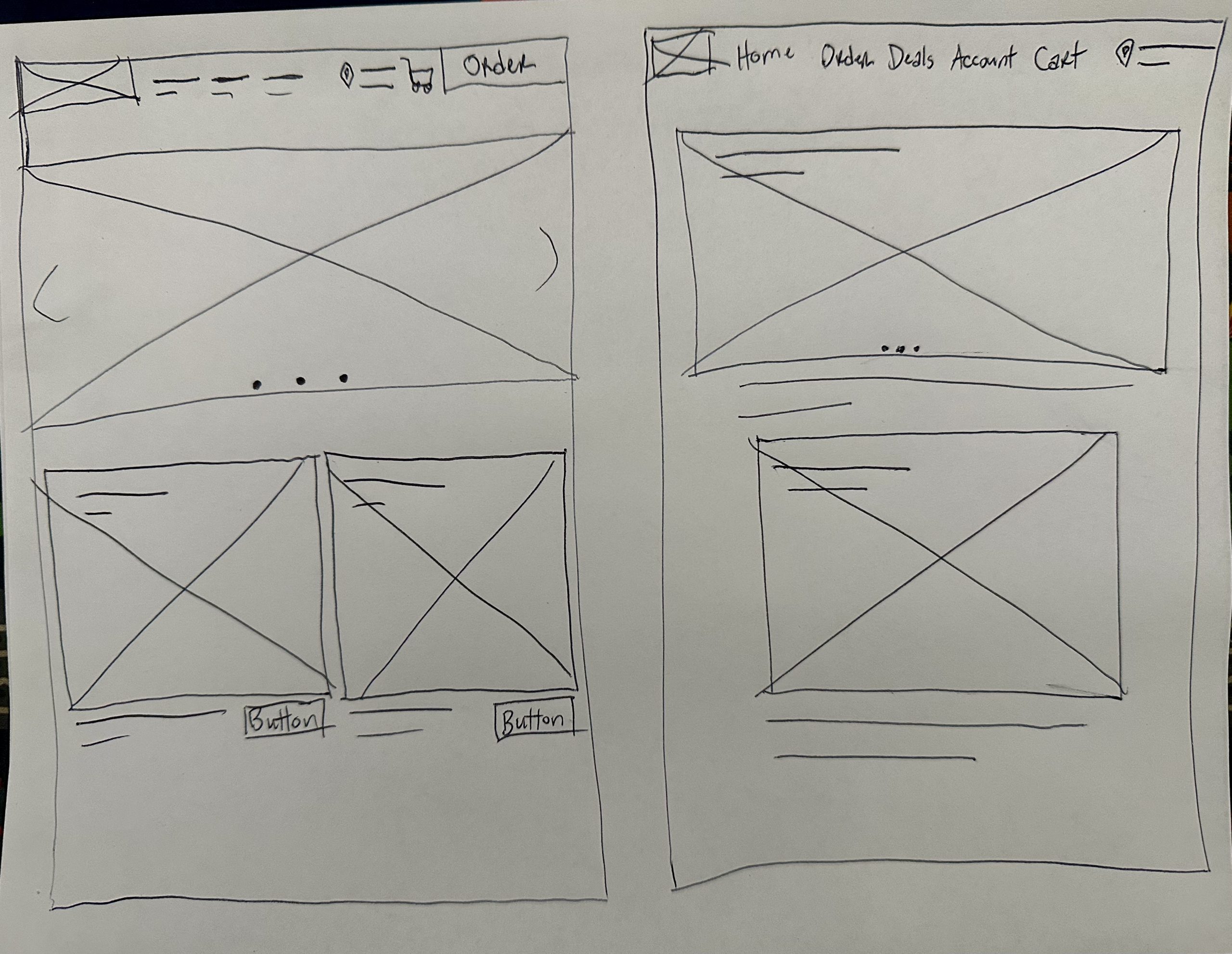
These are some of the questions that must be answered when identifying the user base. After completing a competitive audit and gathering feedback from our competitors’ user reviews, I was able to develop user personas which should match the needs of our users.

Joe Persona

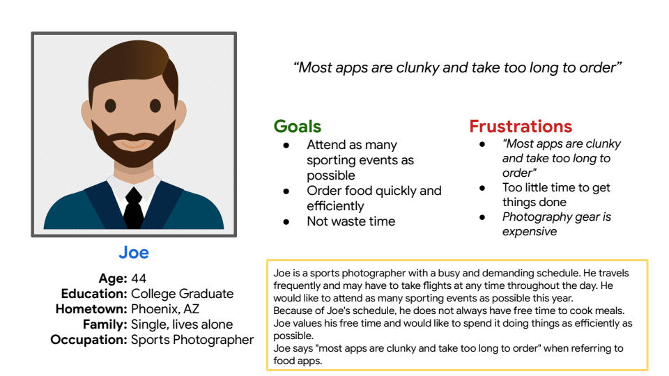
Joe is a 44 year old sports photographer with a demanding schedule. He travels frequently and would like to attend as many sporting events as possible. Because of Joe’s schedule, he does not always have time to cook meals.

“Most apps are clunky and take too long to order…”

Justine Persona

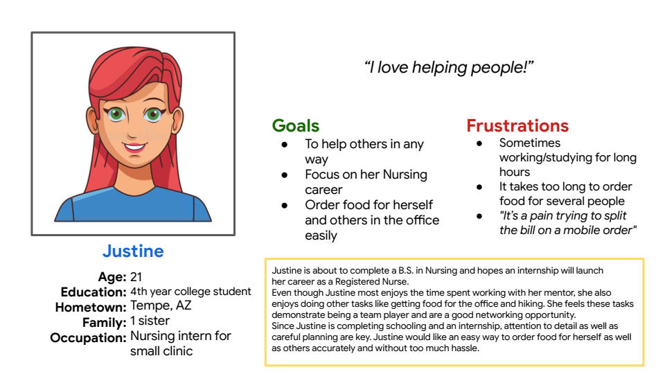
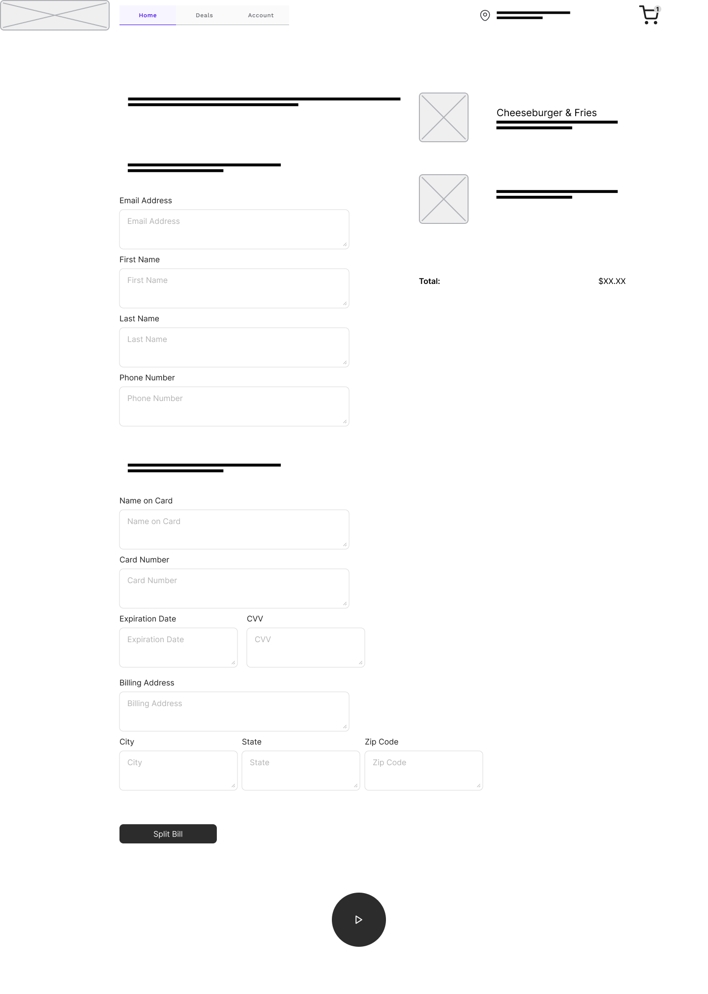
Justine is a 21 year old Nursing student and intern who is looking to start her career in healthcare. During her internship, Justine likes to order food for the office as a way of team bonding. Since she is just beginning her career, she cannot afford to cover the tab for everyone so each person must cover their portion.

“It’s a pain trying to split the bill…”

Based on these personas, we can confirm that our target users are busy professionals, between the ages of 21-44, who order takeout often and value being able to do things easily and quickly.

The Beginning

The goal of this personal project was to create a responsive website for a restaurant. This was an assignment from my Google UX Design course where I had previously created a mobile app for the same restaurant, UX Burger. Although I had previously created a UX Burger mobile app, I treated this project as if it was being created from scratch but honing in on some of my newfound skills to create a better experience/design.

The first step in the design process was to complete a competitive audit. This allowed me to identify our direct competitors (TGI Friday’s, Cracker Barrel), learn their strengths from a design standpoint as well as their weaknesses and any gaps or opportunities for improvement that I could implement into UX Burger. The same approach was taken with indirect competitors such as fast food restaurants like Wendy’s, Taco Bell or Door Dash.

I also used the user reviews from competitors’ mobile apps to get a feel for what users enjoyed and identify any pain points within those apps.

Meet Joe & Justine

Based off the user research gathered, I created user personas to help identify potential users of the UX Burger website and create a design that tailored to their needs.

The first persona, Joe, is a 44 year old sports photographer with a demanding schedule. He travels frequently and would like to attend as many sporting events as possible. Because of Joe’s schedule, he does not always have time to cook meals. Joe would like a way to order food quickly and efficiently.

The second persona is Justine, a 21 year old Nursing student and intern who is looking to start her career in healthcare. During her internship, Justine likes to order food for the office as a way of team bonding. Since she is just beginning her career, she cannot afford to cover the tab for everyone so each person must cover their portion. Justine would like a way to order food for herself and others easily.

Based on these personas, we can confirm that our target users are busy professionals, between the ages of 21-44, who order takeout often and value being able to do things easily and quickly.

Putting it on Paper

After defining our users and learning their needs, it was time to began the ideation phase. I started with paper wireframes and began sketching a basic layout for the website. Since this is a restaurant, large photos are a must, allowing the user to see the entrees in detail. The initial idea was to create a large carousel at the top of the page which featured important menu items, followed by other less important but still noteworthy items below. I also went through a few iterations with the top navigation, going back and forth between a basic text menu or adding an order button.

I like to get a general idea of what the homepage will look like before moving on to other screens as I feel the homepage sets the tone and theme for the remaining screens.

As a final step, I created mobile versions of the main screens, adjusting the scale of the items to fit the much smaller canvas.

Going Digital

Once the initial screens were created, it was time to turn them into digital wireframes. This was done so that I could quickly make iterations to the design with ease. I made several versions of the home page to test the placement of images and buttons before ultimately sticking to my first design. The thought process here was to have large images with minimal text so that the user could quickly scan the page. When designing for desktop, there is quite a bit of screen space to work with so it was a crucial that I take advantage of the space without adding too much “fluff” to the page. It took a bit to nail down the scaling and placement on each screen but once I was happy it was time to move on to the mobile versions.

The mobile versions required some re-scaling to fit the smaller canvas and I made sure to stack the components in a way that would not affect their readability but still be visible on a smaller screen. For example, on the order screen, I went from a 4 column layout to 2 across. I also resized the entree images from 263px to 210px. Body text remained unchanged, staying at 16px.

After creating all of the screens for the core user flow, it was time to turn these wireframes into a low-fidelity prototype. I connected all of the screens together to show how a user would complete an order on the website.

In order to improve efficiency, the idea is to allow the user to complete as many steps as possible without changing screens. The user can add an item to cart by selecting the ‘+’ icon or see what is in their cart by clicking the ‘shopping cart’ icon all without having to move to a separate screen. This should speed up the order process and improve the overall user flow.

Time for Testing

The testing phase for this website was certainly an interesting time. I selected 5 participants which fit our target user demographic and asked them to complete a task. The goal was to notate any pain points or issues with the user flow.

Through user feedback I was able to understand that most of the issues were with prototypes in general rather than my specific design. It was difficult for users to “look at the big picture” when there are placeholder images and text all over the place. Certainly not what I was expecting so usable feedback was limited.

All hope was not lost however!  Through the usability testing, I learned that the buttons on the Shopping Cart and Checkout screen were not optimal. They could become a potential pain point as the buttons only contain icons but no text to state their intended use. Perhaps a more standard button would be better in its place and is something that should be considered in future iterations.

Approaching the Finish Line

At this point in the process, we are very close to the finish line. We have conducted user research, created wireframes, completed usability testing and now it is time to create high-fidelity mockups. Creating these mockups are where the fun starts as we’ll finally get to see what the finished product will look like!

Let’s break down some of the design choices from each screen.

On the home screen, we have a large carousel used to display some of the high quality entrées of the restaurant. This helps to create a positive first impression for the user as well as boost sales by offering these items as deals.

This page also features a large, red Order Now button which is always on top. It remains in view so the user can start an order at any point and it’s color helps draw the user’s attention and signify an important call-to-action.

Home Screen
Home Screen
Order Screen
Order Screen

The order screen was designed with maximum efficiency in mind. It features tabbed sections (Appetizers, Entrées, Desserts, Beverages) as well as a search bar so that you can quickly locate your favorite items.

You also have the ability to quickly add items to cart by pressing the ‘+’ icon. This saves time during the ordering process by allowing you to add items to your cart without having to visit each page individually.

The item detail screen features a single, large image to display the entrée. These photos need to be high resolution and high quality so that they can properly showcase the menu items.

There are also clickable buttons for the ingredients that allow a user to customize their order.

The “You May Also Like…” section gives the opportunity to upsell to the user by allowing them to add additional items to their cart. The best part is they can do this without leaving the page by simply clicking the ‘+’ icon.

Item Detail Screen
Item Detail Screen
Shopping Cart Screen

In order to improve efficiency in the order process, I have removed the dedicated shopping cart page. Instead, the user can simply click the shopping cart icon from any screen to access their cart items.

The checkout button has also been changed from a round button w/ icon to a standard button, consistent with the rest of the design.

The account screen allows users to create an account/login to access rewards or save their card information for future orders. The users are also given several options for creating an account (via Apple ID, Google, Facebook) to make it convenient and limit abandonment during the creation process.

However, if a user does not wish to create an account, they can still place an order by simply selecting “Continue as guest.”

Creating an account allows for customer retention which can lead to increased sales for the business.

My Account Screen
My Account Screen
Checkout Screen
Checkout Screen

The checkout screen allows users to select a time (and location) to pick up their order. This allows a user to place an order in advance if they are not immediately available to pickup.

The checkout screen also has additional options such as a text box for typing in a tip amount and a split bill button.

You’ll also see opportunities for a user to add last minute items to their cart via the “You May Also Like…” section.

The split bill screen is accessible from the checkout page and allows users to pay for their order with multiple forms of payment.

Customers can be added on the left side and the entrées can be drag-and-dropped under each customer to split the bill.

Split Bill Screen
Split Bill Screen
Order Complete Screen

The order complete screen is the last page a user will see when placing an order. It contains pickup information, an order summary and a clickable map which will give directions to the restaurant.

This screen also allows users to sign up for a newsletter so they can receive exclusive deals for future orders. This is another form of customer retention and should lead to more sales for the business.

Last Round

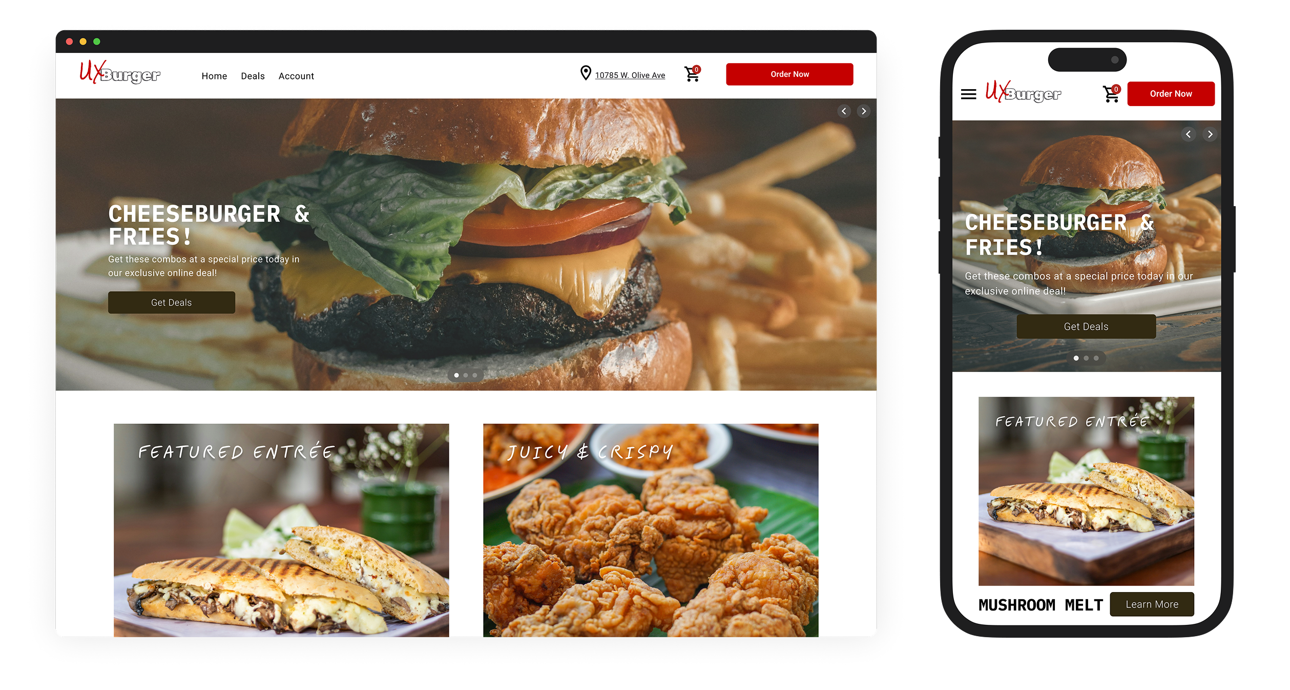
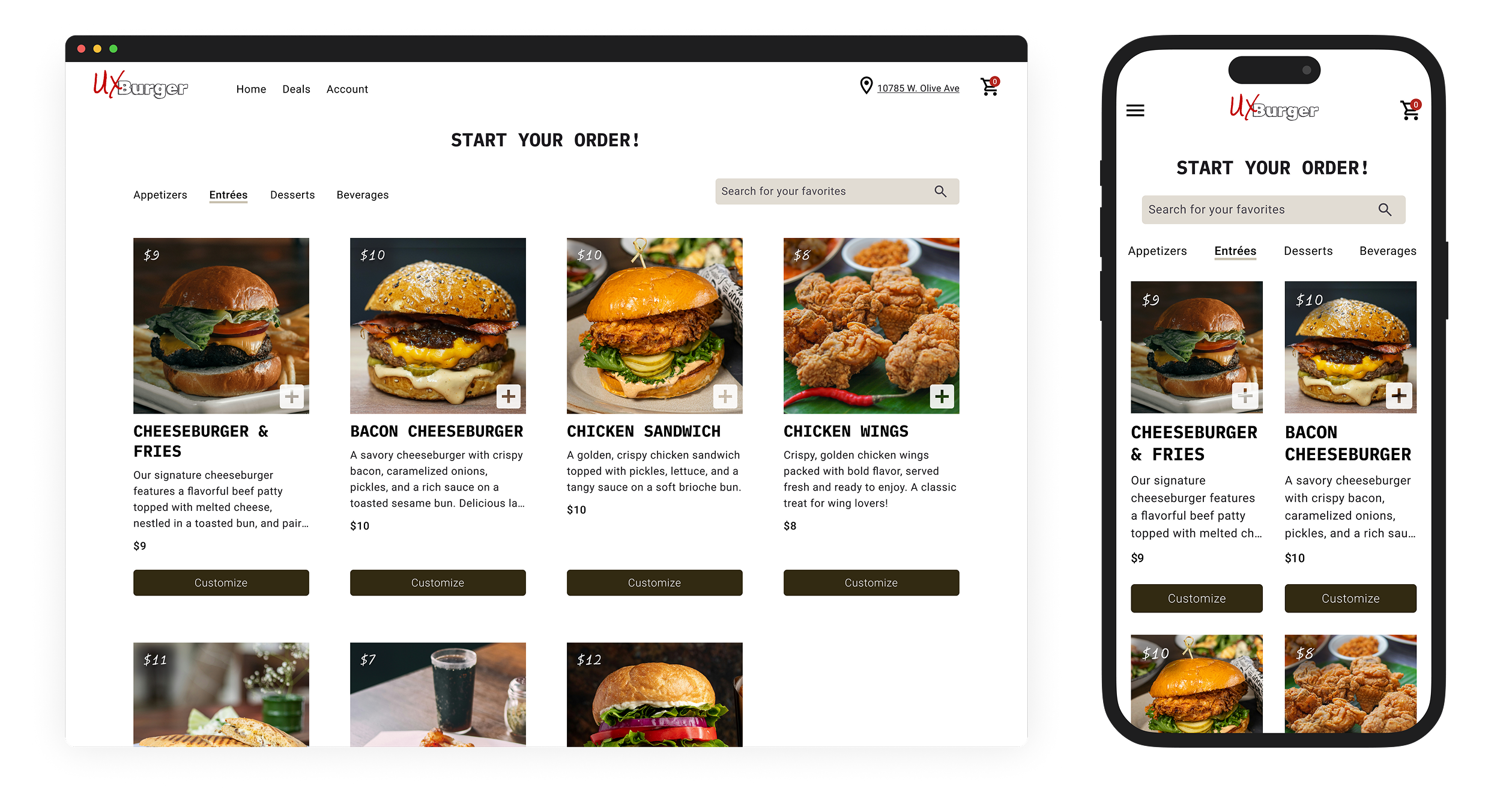
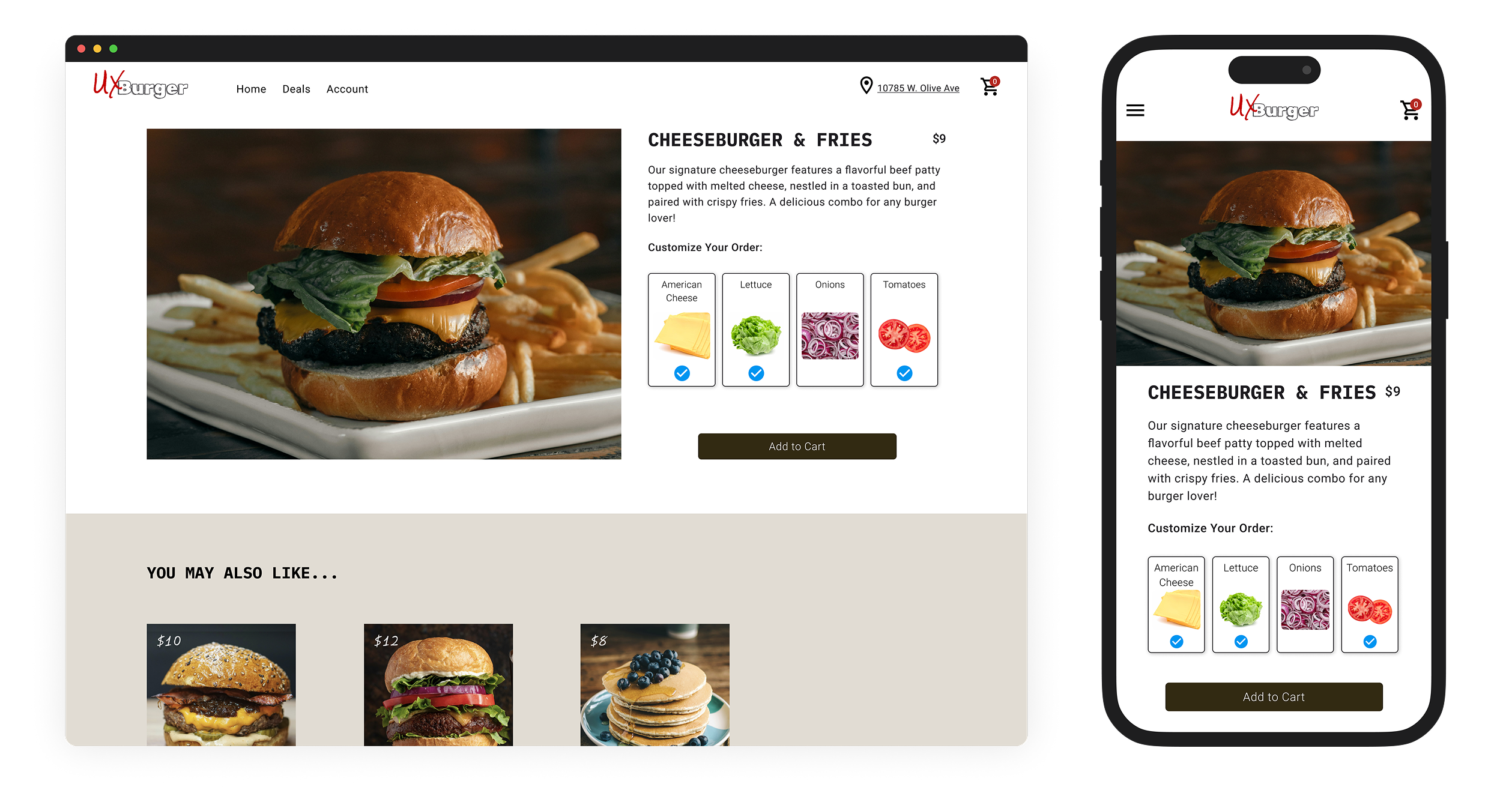
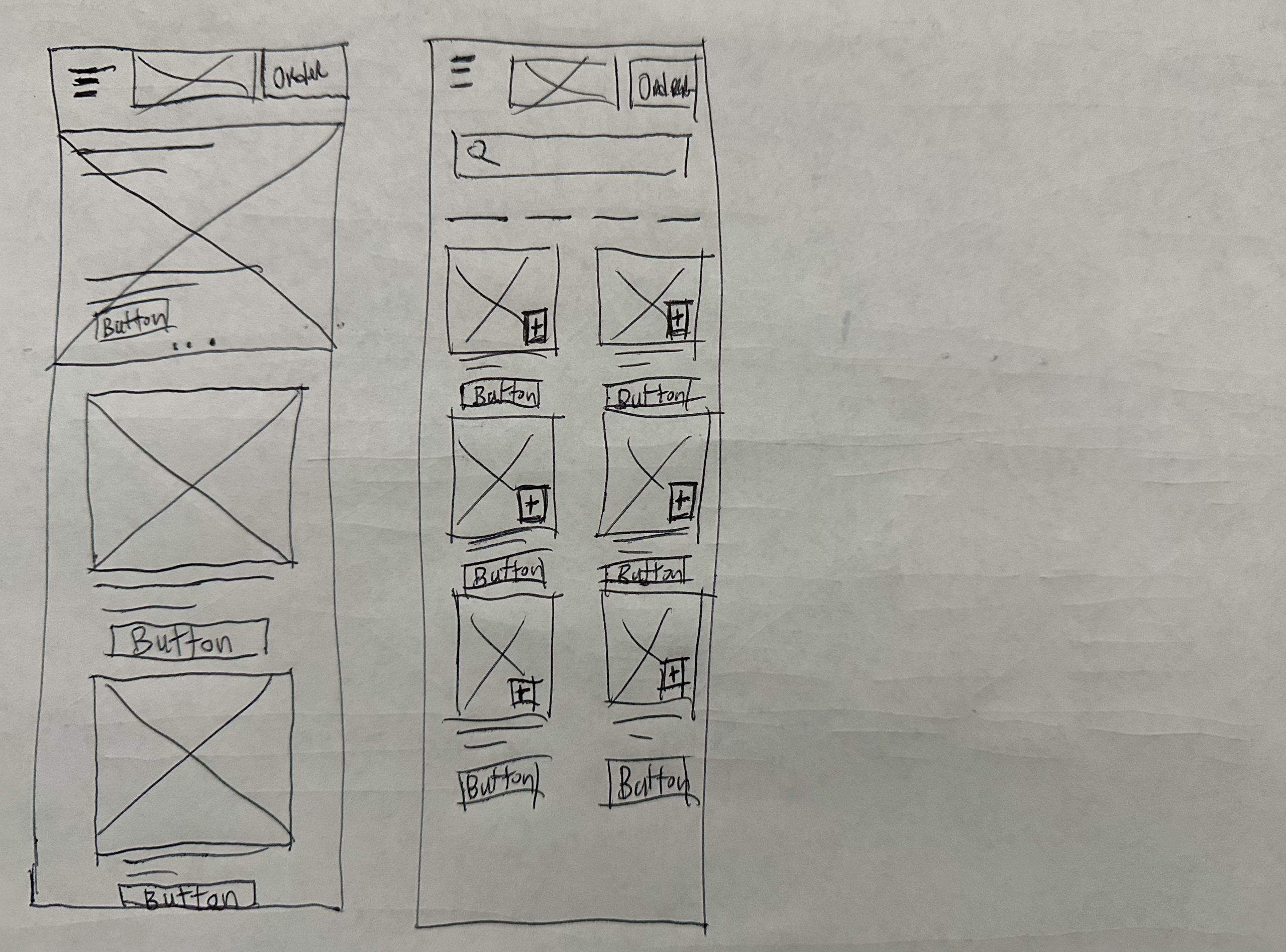
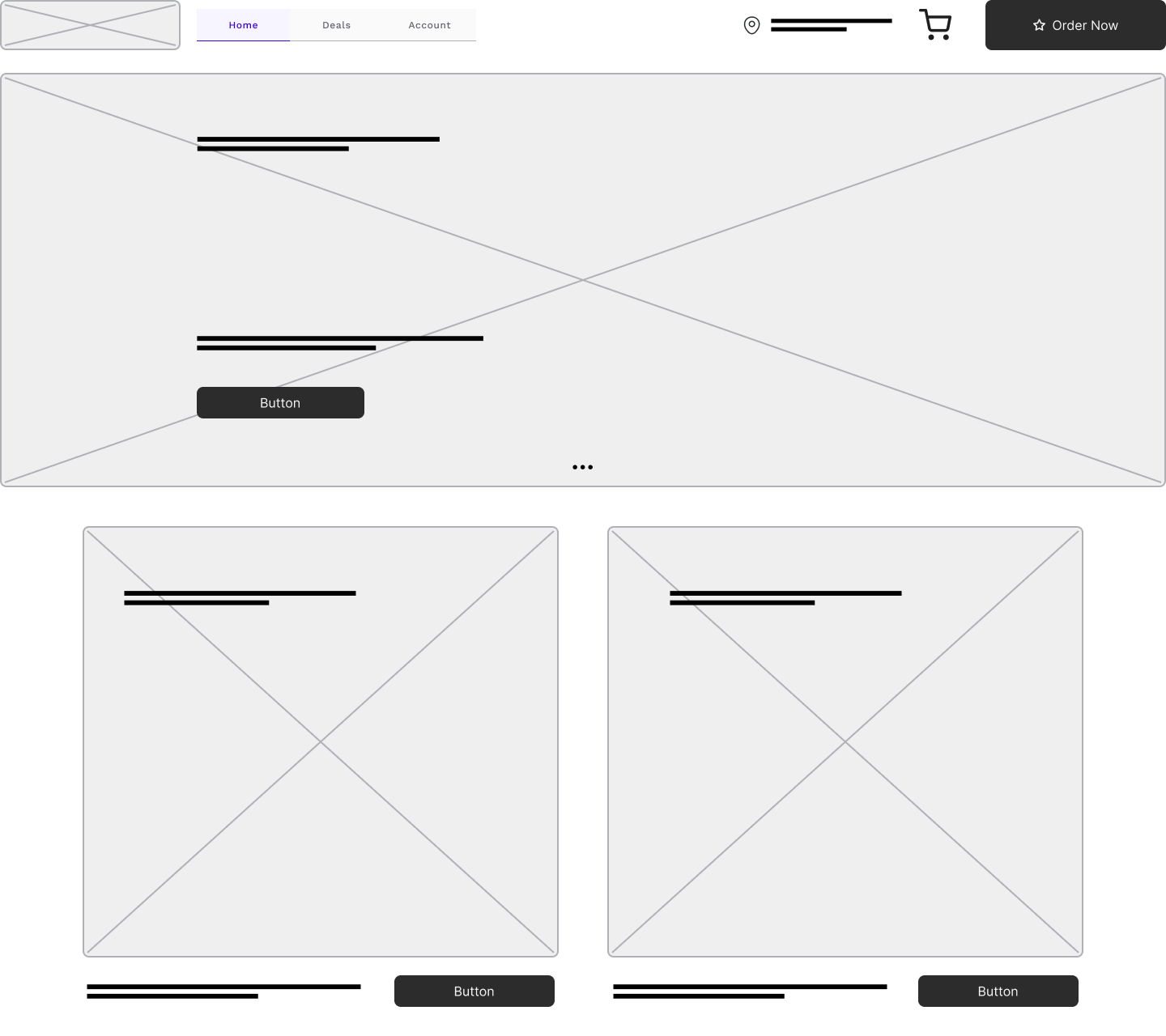
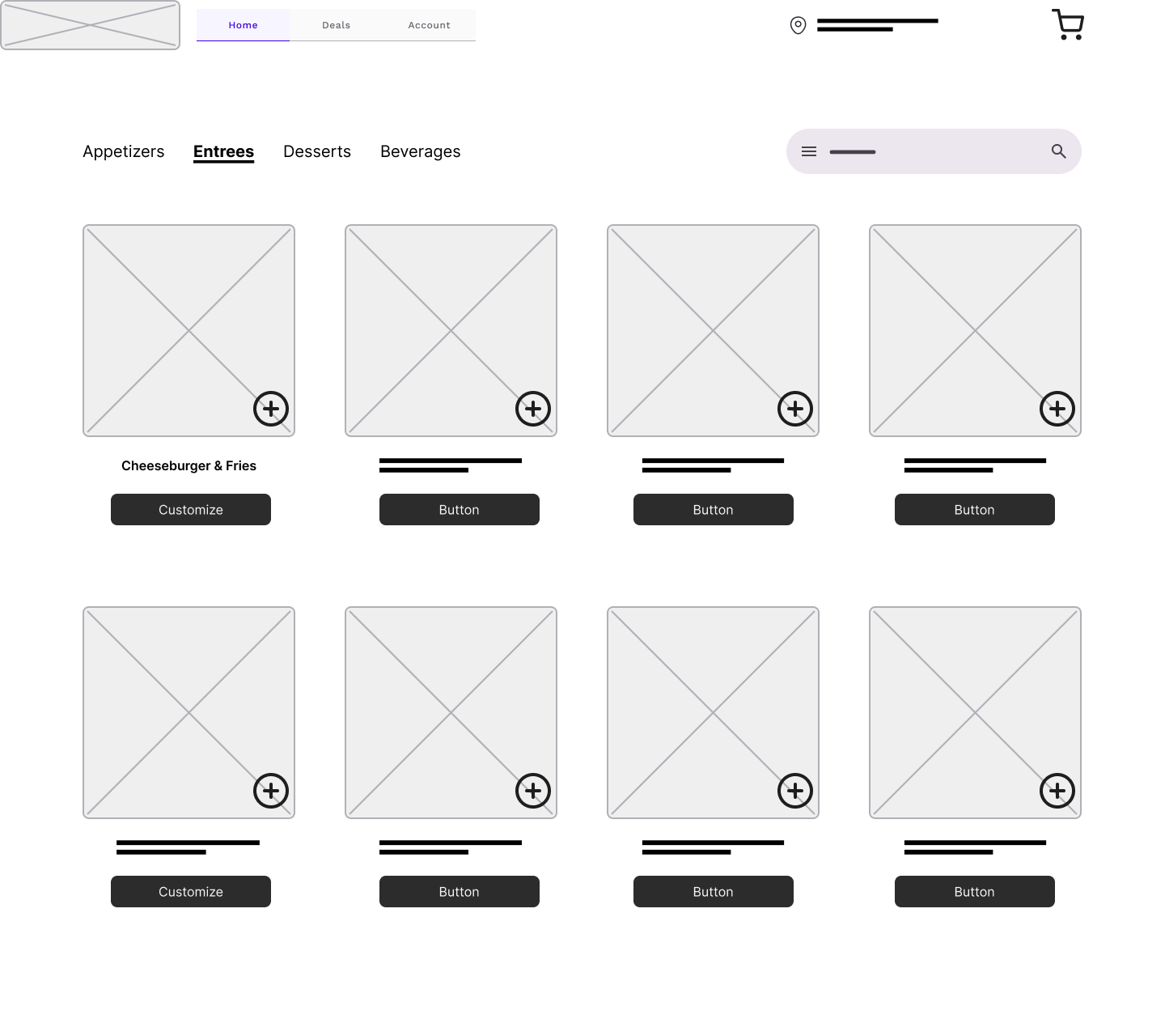
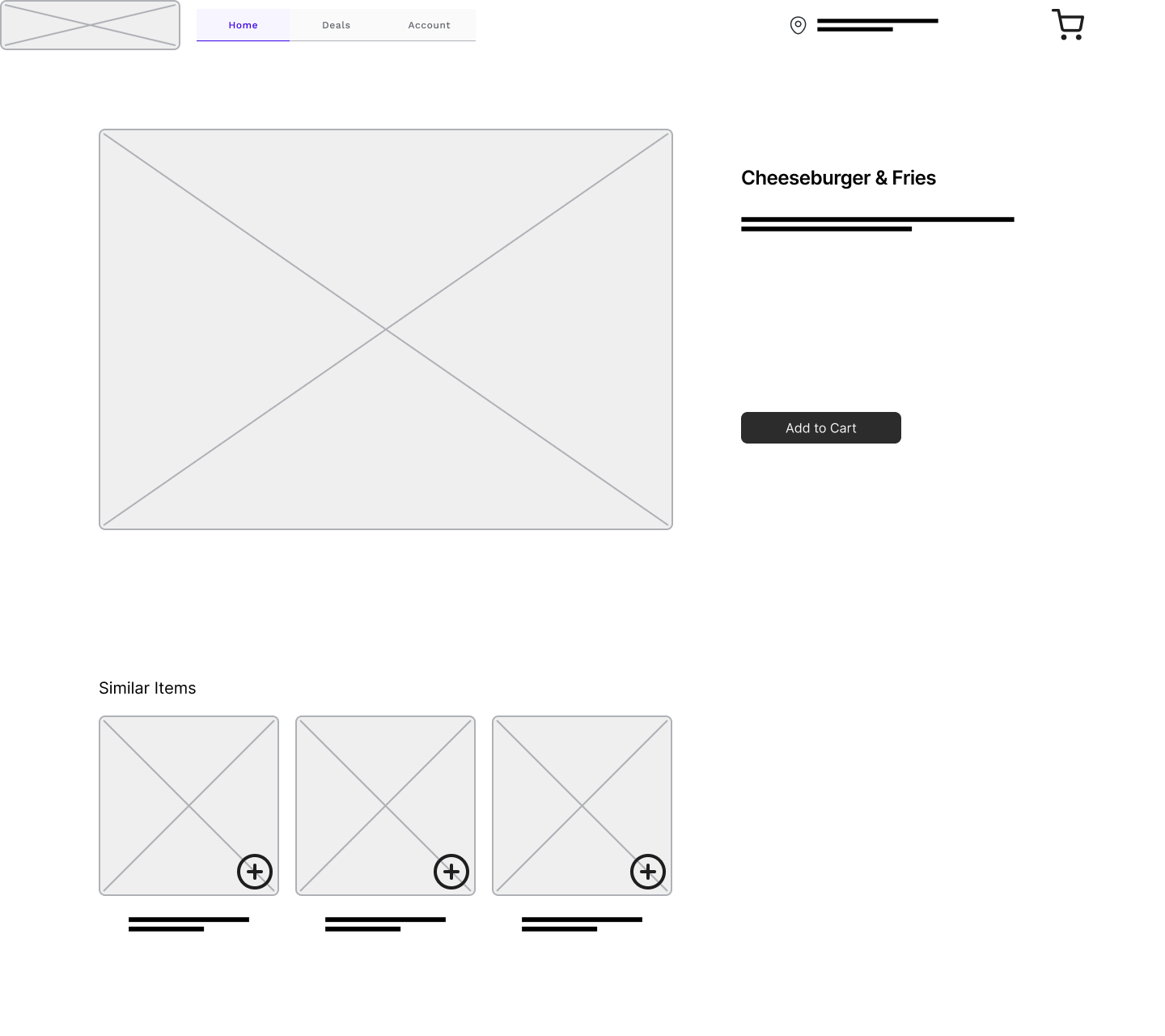
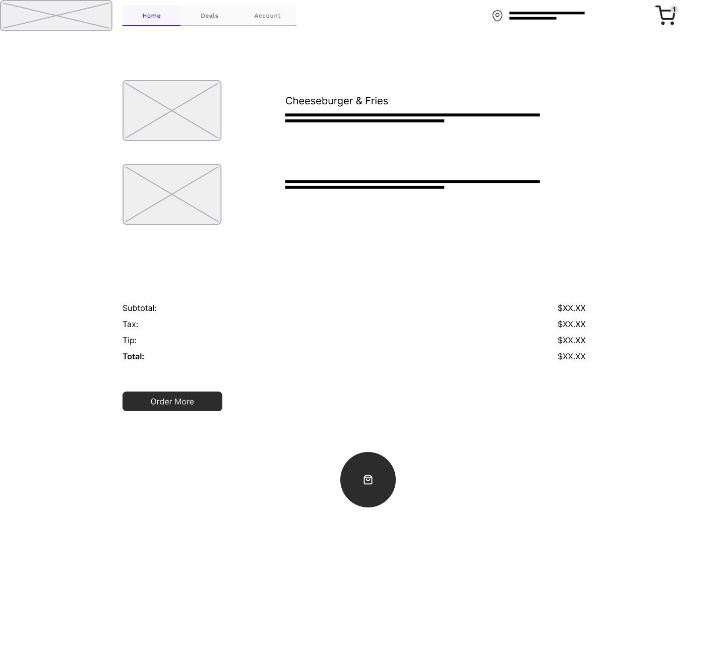
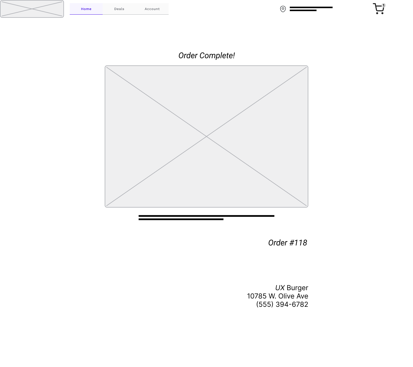
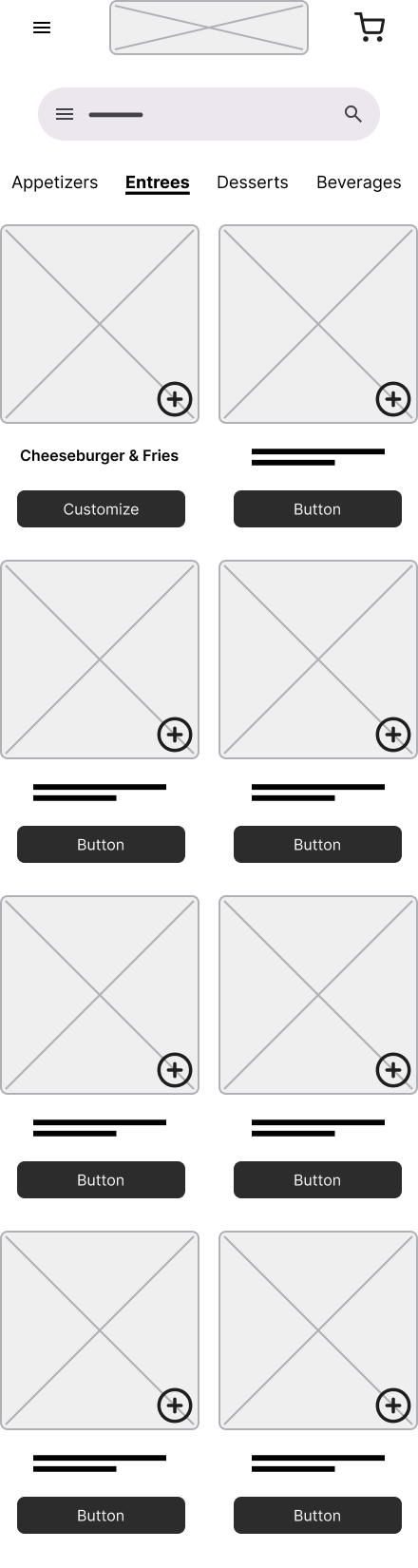
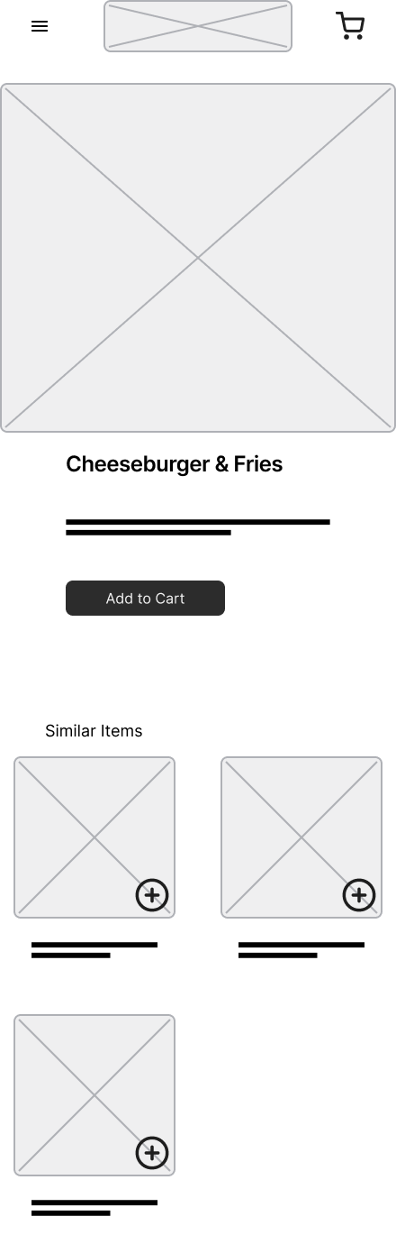
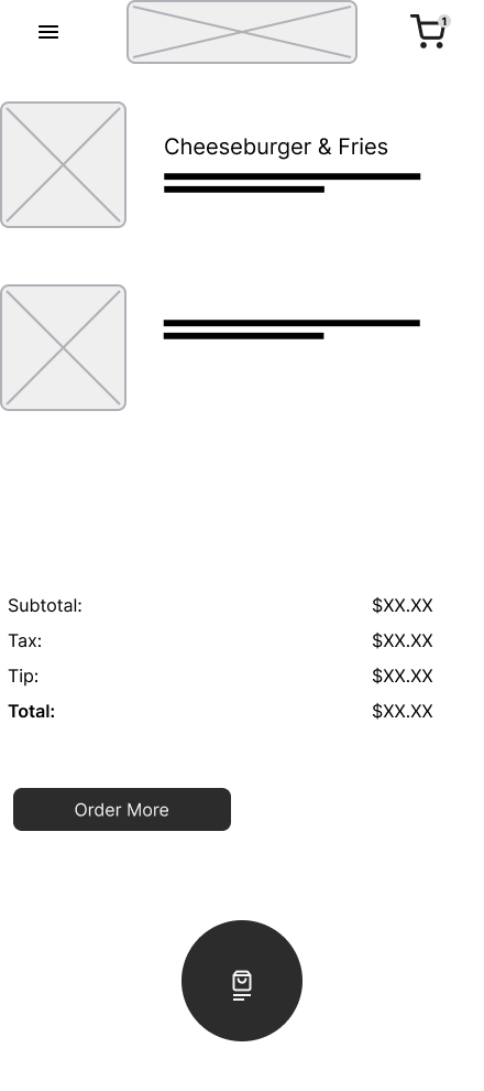
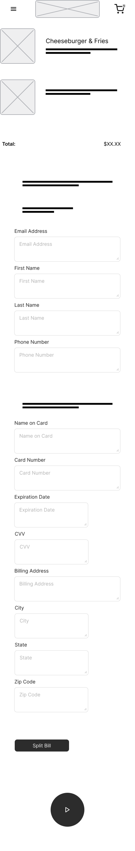
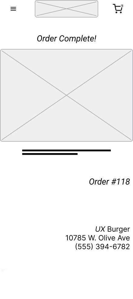
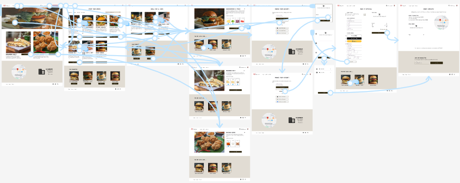
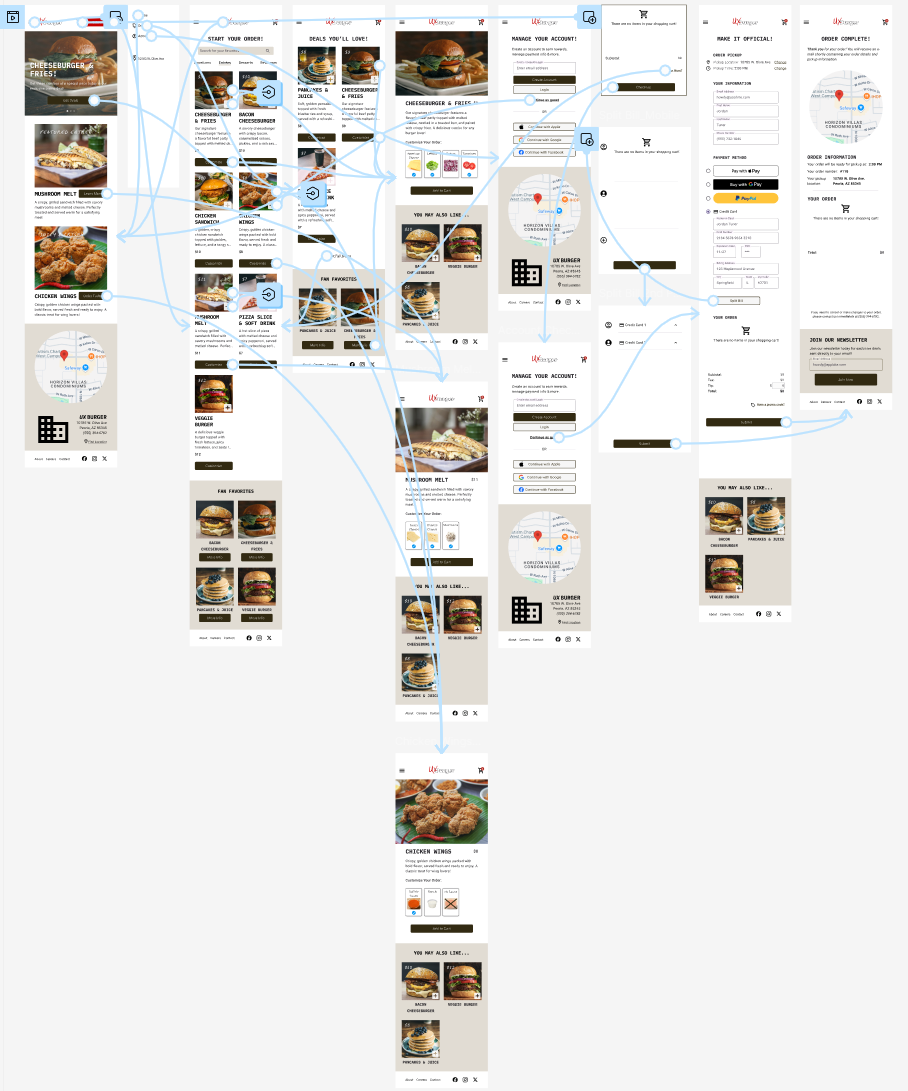
Before starting the final round of testing, I connected all of the screens together for desktop and mobile to create high-fidelity prototypes. Users are able to add items to cart, place an order and preview the split bill feature.

Hi-fi Desktop Prototype Hi-fi Mobile Prototype

To conduct the testing, I recruited 5 users within the target demographic and had them complete various tasks in order to identify any pain points or technical issues. During the testing, most users were able to complete the order process without issue however the login screen did slightly slow down the process. I believe this was due to the “Continue as guest” option being the only selectable option in the prototype and do not anticipate it being an issue in a live environment.

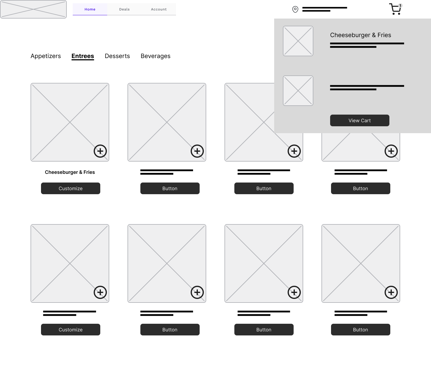
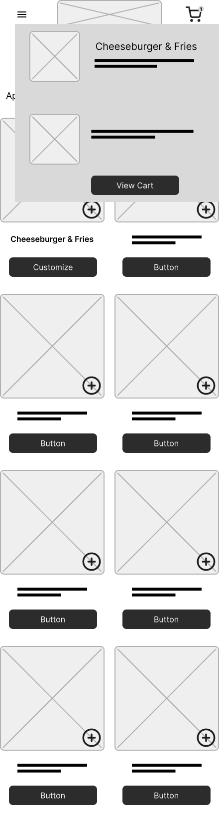
I was able to identify one consistent issue when users were completing the order process. The shopping cart overlay is not always visible when a user adds an item to cart towards the bottom of the page. This can cause a user to mistakenly add an item to cart multiple times.

overlay cutoff

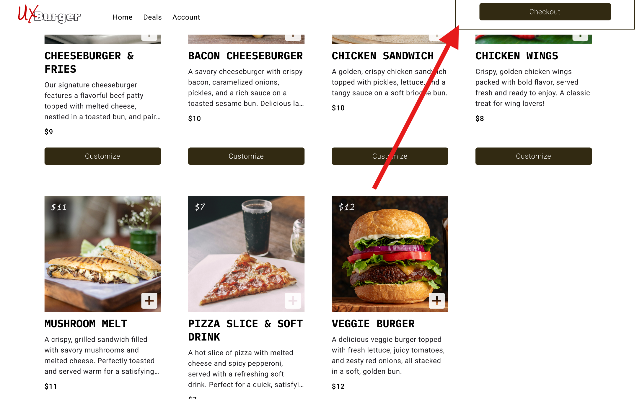
In a future iteration, I will need to address this by making the shopping cart overlay appear in all scroll positions or give a visual confirmation when adding an item to cart. I will need to complete more testing to determine the best course of action.

The End

At this point, the project is considered complete! I have addressed all of the user needs by streamlining the order process, allowing users to split the bill and creating clear, intuitive navigation. I received feedback from users and iterated the design until users could successfully complete an order without any significant hiccups or pain points.

Lessons Learned

There were a few lessons I learned during the design process for this website:

  • Usability testing is important! Users can discover issues you did not consider during the design process.
  • Not all users are created equal! They have varying degrees of technological literacy and this must be taken into account when designing for the user.

Next Steps

No project is ever done! In the next iteration I could add the following:

  • Allow the shopping cart overlay to be visible regardless of scroll position.
  • Create a visual indicator to let the user know when an item has been successfully added to cart.
  • Add selectable tip percentages on checkout screen
Scroll to Top