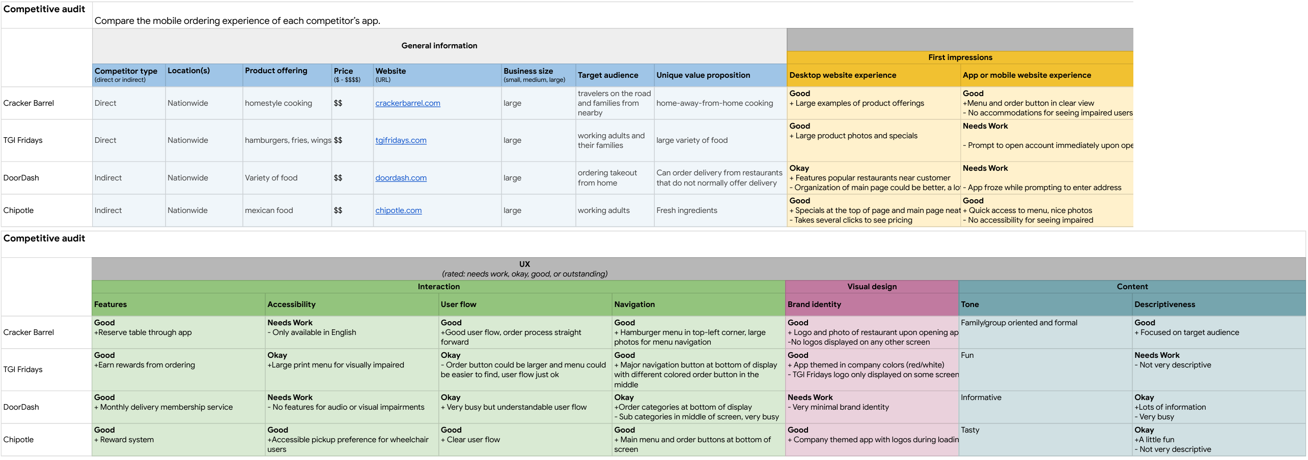
I completed a competitive audit to get a better understanding of the market and identify any direct/indirect competitors of UX Burger. This was an important step to take as I could notate what is working well for users of those apps and any potential pain points to make sure they are not replicated in the new app.
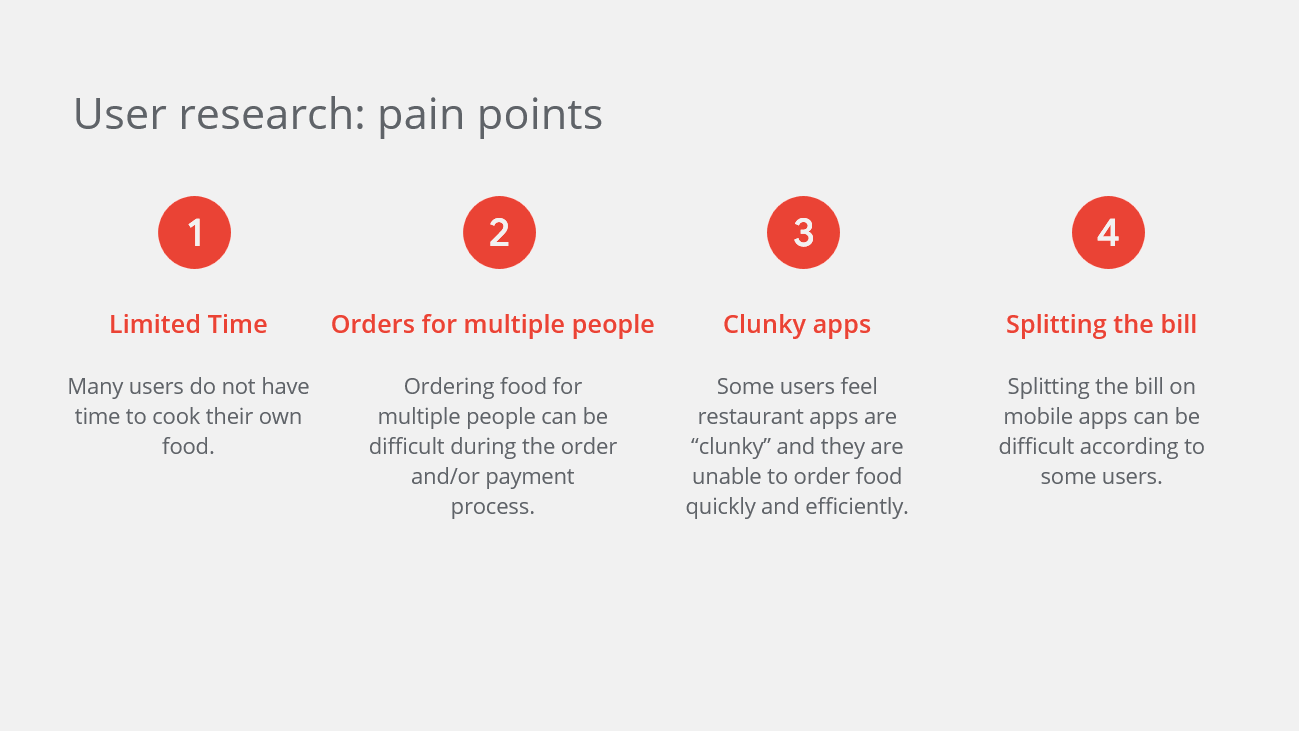
Below are some of the pain points that were identified during the user research.
After completing the competitive audit and gathering feedback from our competitors’ user reviews, I was able to develop user personas which should match the needs of our users.
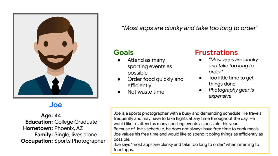
Joe is a 44 year old sports photographer with a demanding schedule. He travels frequently and would like to attend as many sporting events as possible. Because of Joe’s schedule, he does not always have time to cook meals.
“Most apps are clunky and take too long to order…”
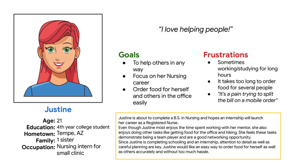
Justine is a 21 year old Nursing student and intern who is looking to start her career in healthcare. During her internship, Justine likes to order food for the office as a way of team bonding. Since she is just beginning her career, she cannot afford to cover the tab for everyone so each person must cover their portion.
“It’s a pain trying to split the bill…”
Based on these personas, we can confirm that our target users are busy professionals, between the ages of 21-44, who order takeout often and value being able to do things easily and quickly.

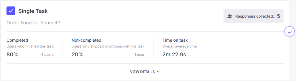
For the testing phase, I selected 5 participants which fit our target user demographic and asked them to complete a task. The goal was to notate any pain points or issues with the user flow.
Surprisingly, most users had trouble understanding that this was a prototype and that there were placeholders for images and text.
“The app isn’t working. It allowed me to select a cheeseburger only and stopped working immediately.”
This skewed the results somewhat but I was still able to identify some opportunities for improvement thanks to session recording.
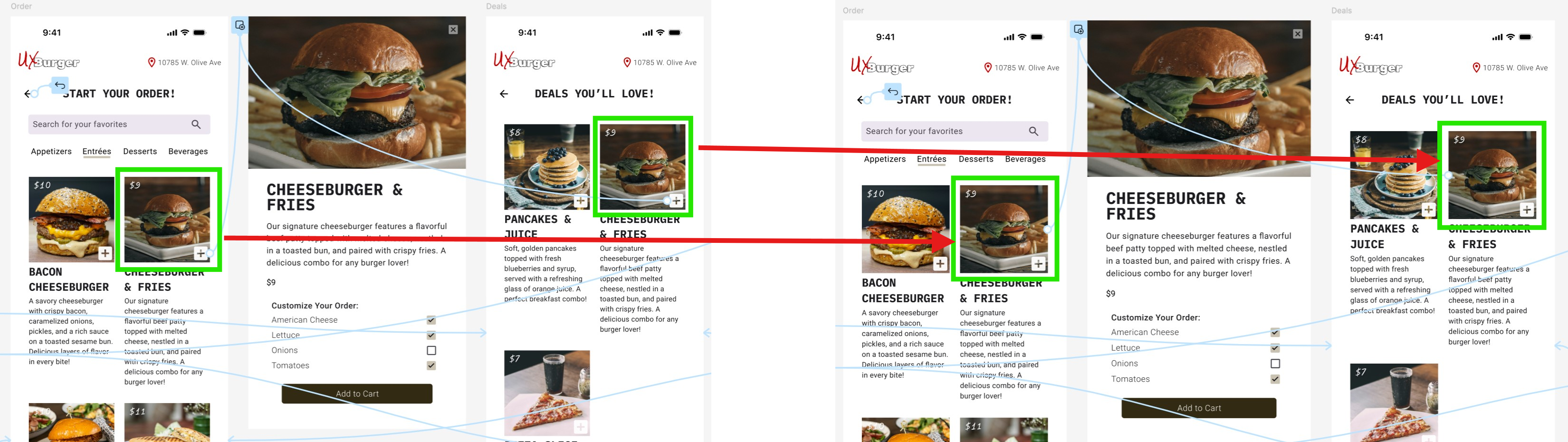
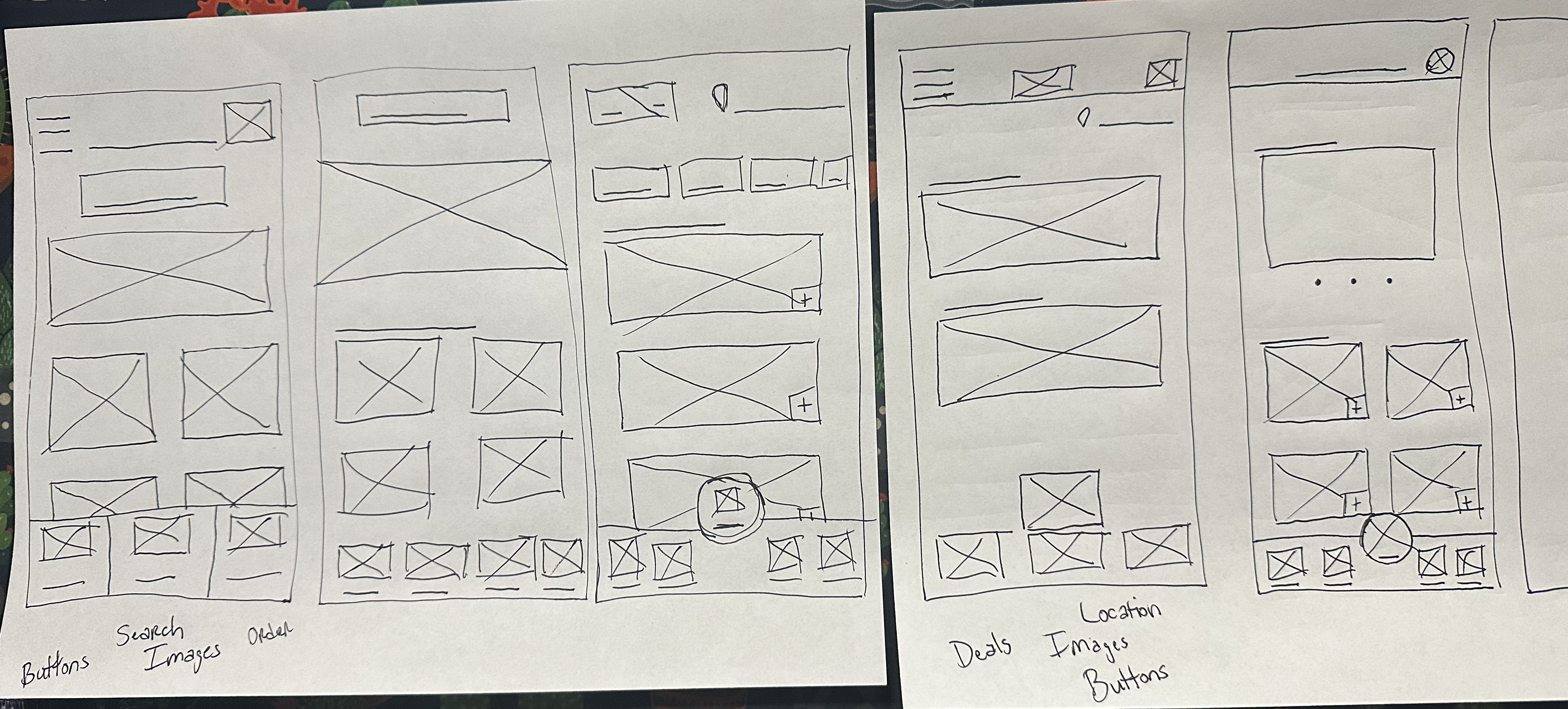
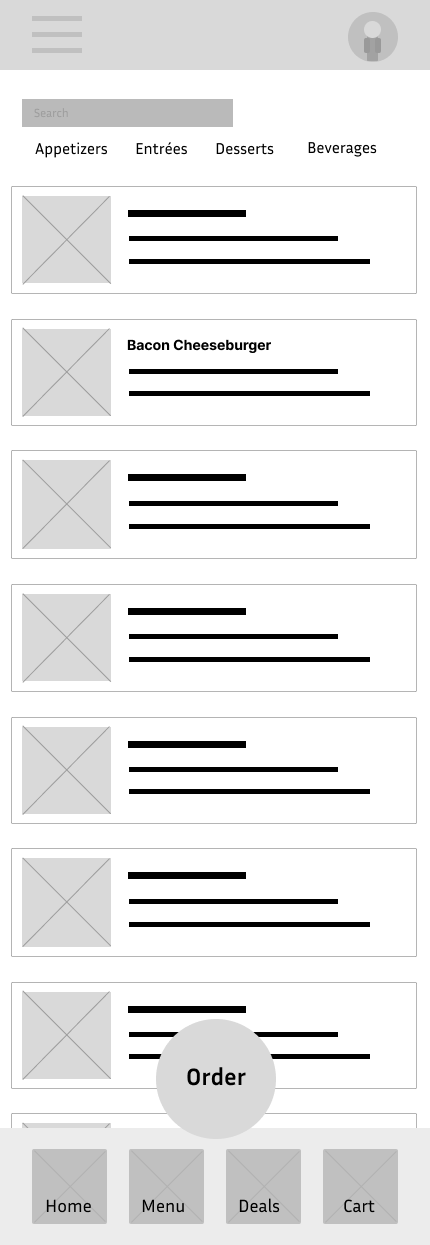
One user was tasked with adding a Bacon Cheeseburger to their shopping cart. I noticed they viewed the item on the Menu page but did not actually add the item to cart before proceeding to the next step (that option is only available on the Order screen). This helped me understand that the user flow was confusing and I needed to simplify the process. There were other examples of users taking an indirect route to complete tasks as well.
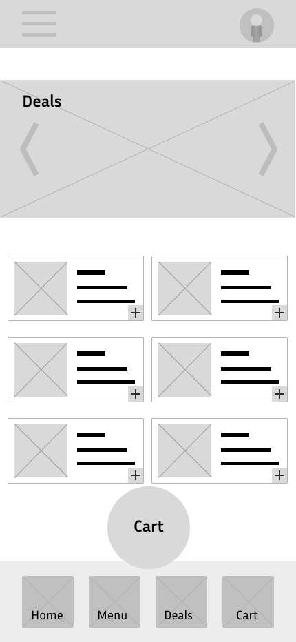
In the next iteration, I decided to remove the Menu page completely as it was adding confusion to the user flow.
At this point in the process, we are very close to the finish line. We have conducted user research, created wireframes, completed usability testing and now it is time to create high-fidelity mockups. Creating these mockups are where the fun starts as we’ll finally get to see what the finished product will look like!
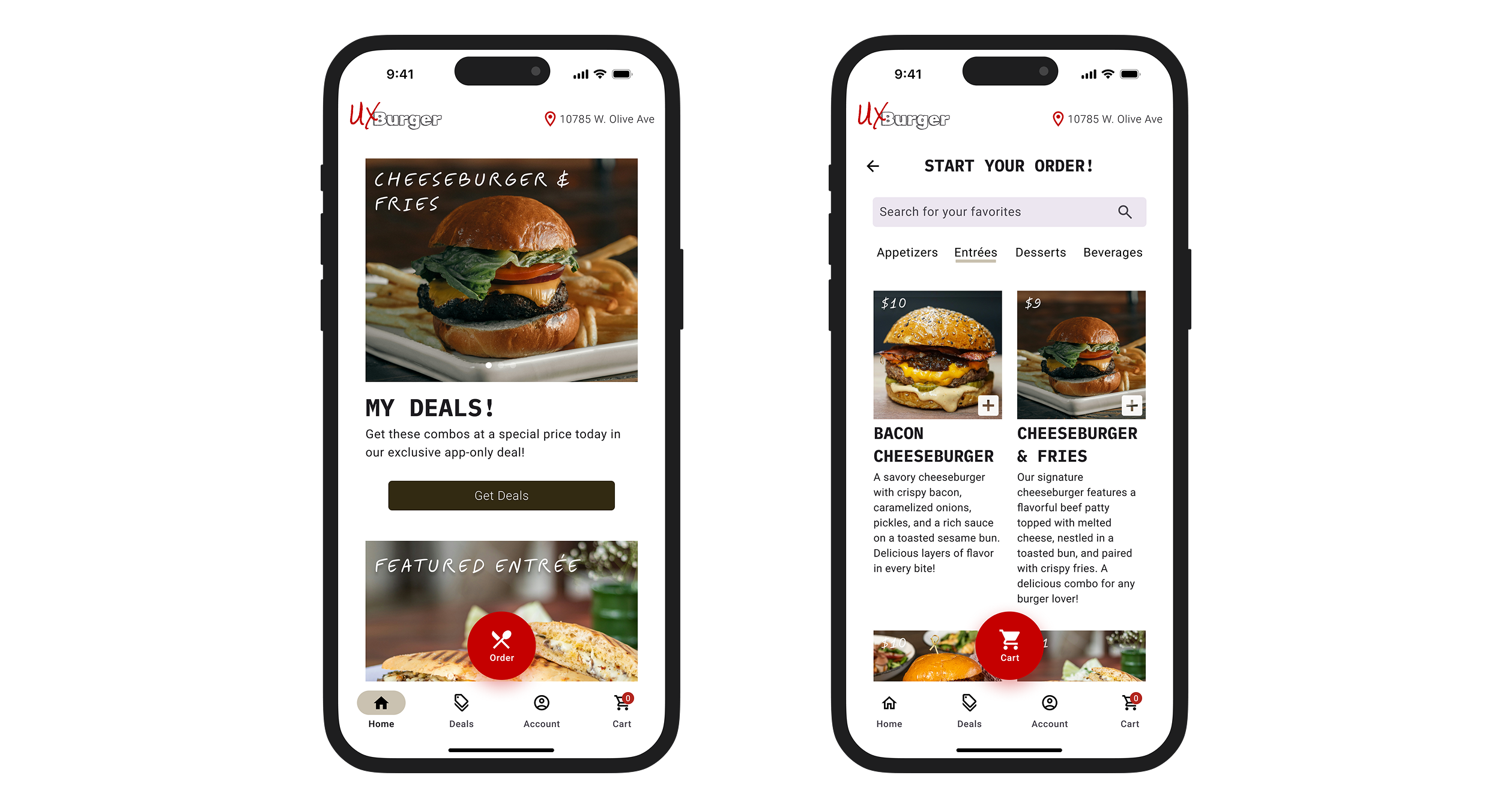
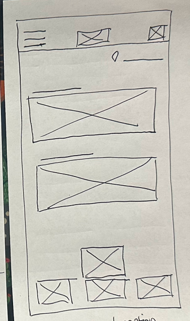
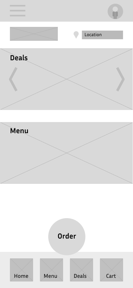
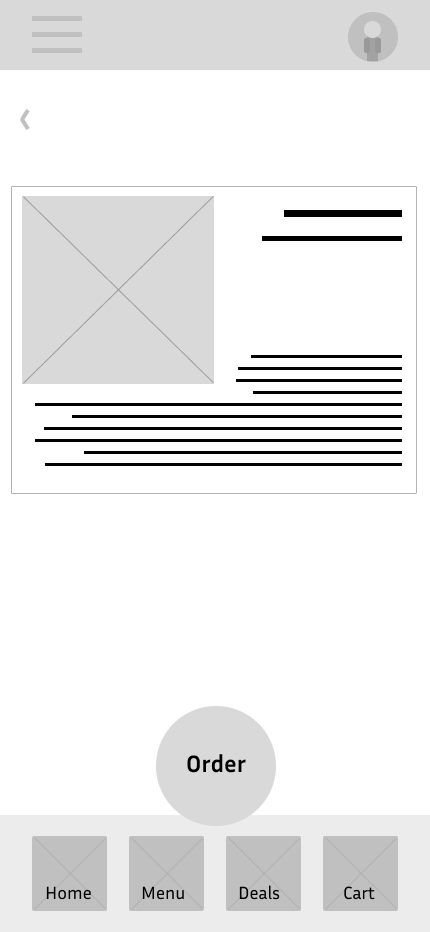
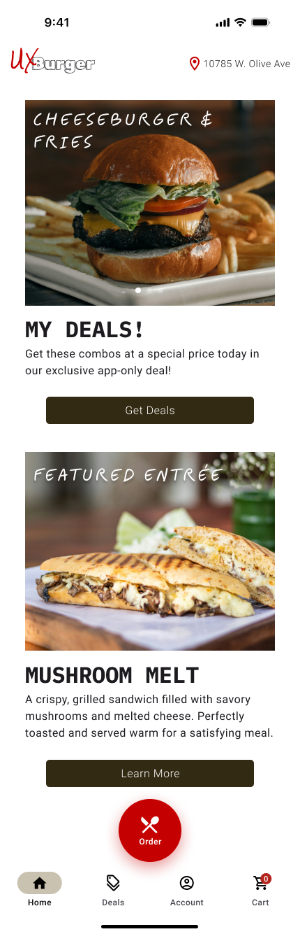
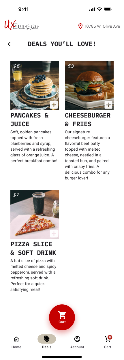
The biggest task in this process is designing the home page. Most restaurant apps treat the home page like a junk drawer, showing ads, recent orders, rewards, “subscribe to our newsletter” and various other things that can make the page look busy. I decided to take a simpler approach by showing a deals carousel and a featured entrée asset. These two items offer value propositions to the user which is good for sales and also assist the user with starting the order process. Aside from that we have a large, fixed, red Order button within thumbs reach that will grab the attention of the user and stimulate the appetite!
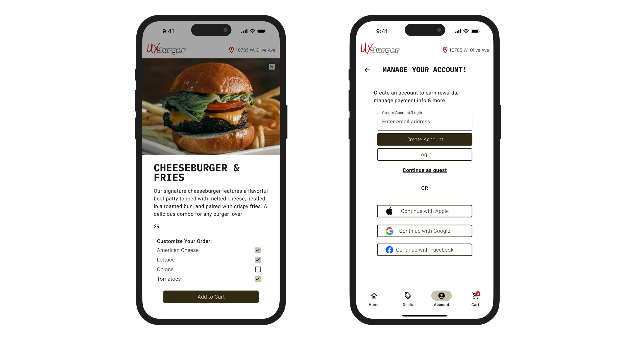
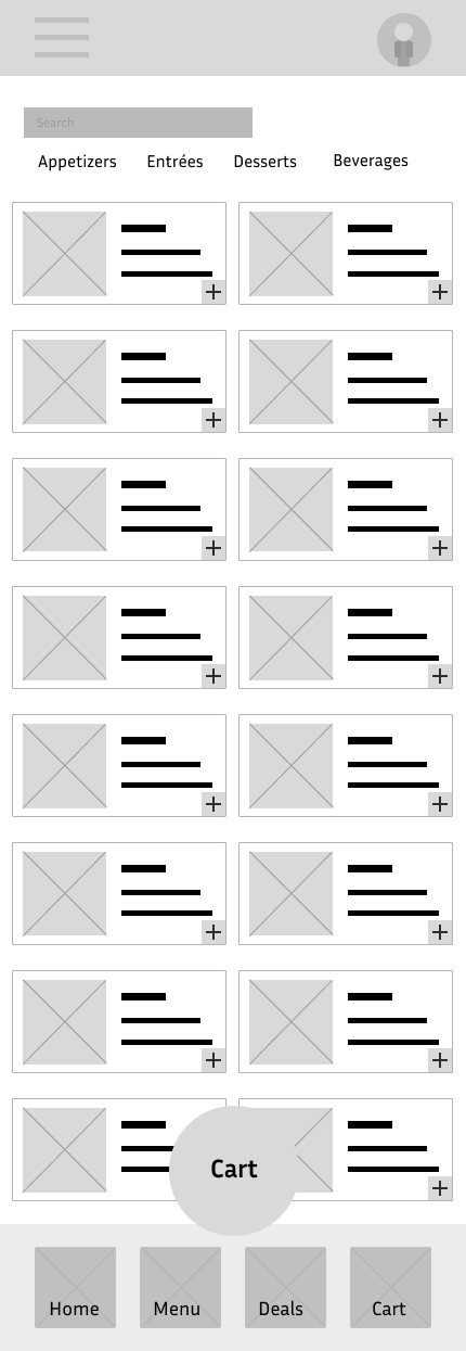
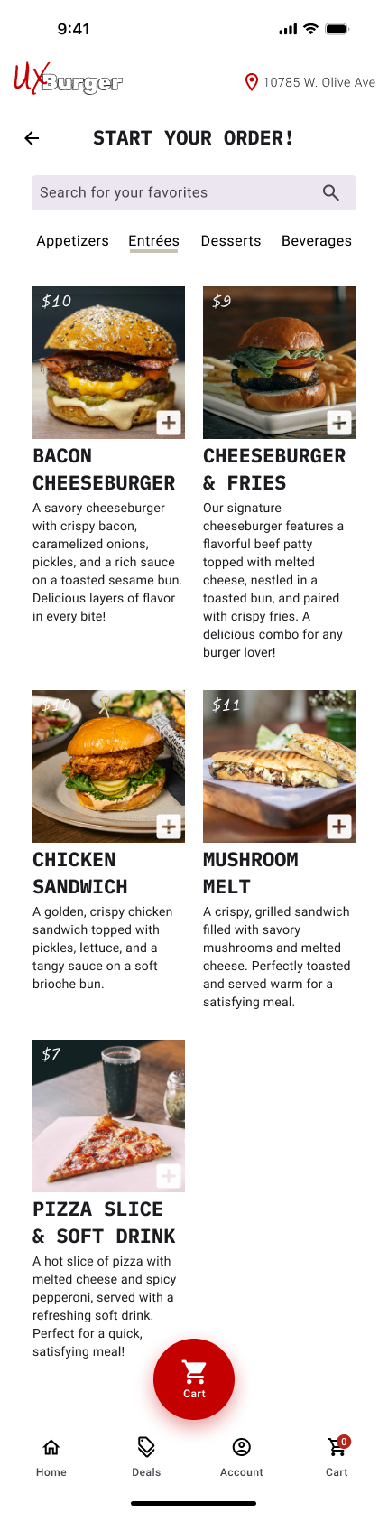
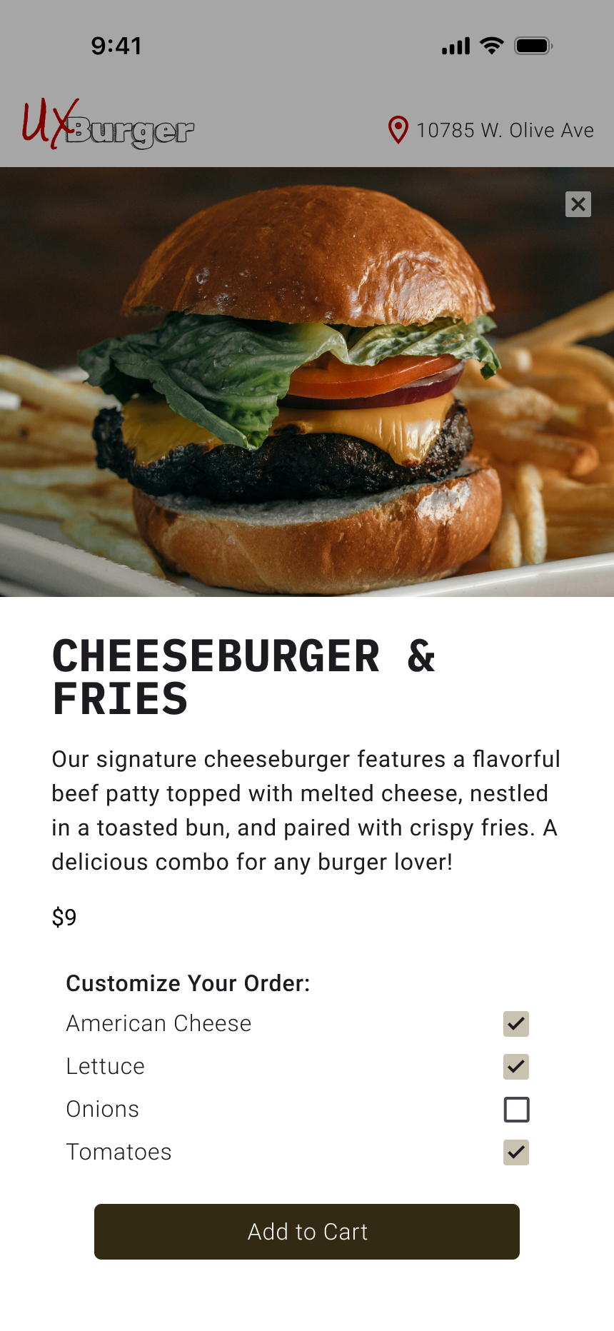
The order page is focused on efficiency, allowing the user to search for their favorite items or quickly swipe between tabs for their favorite entrée, beverage or dessert. Users can also add multiple items to their cart without leaving the order page thanks to the use of overlays.
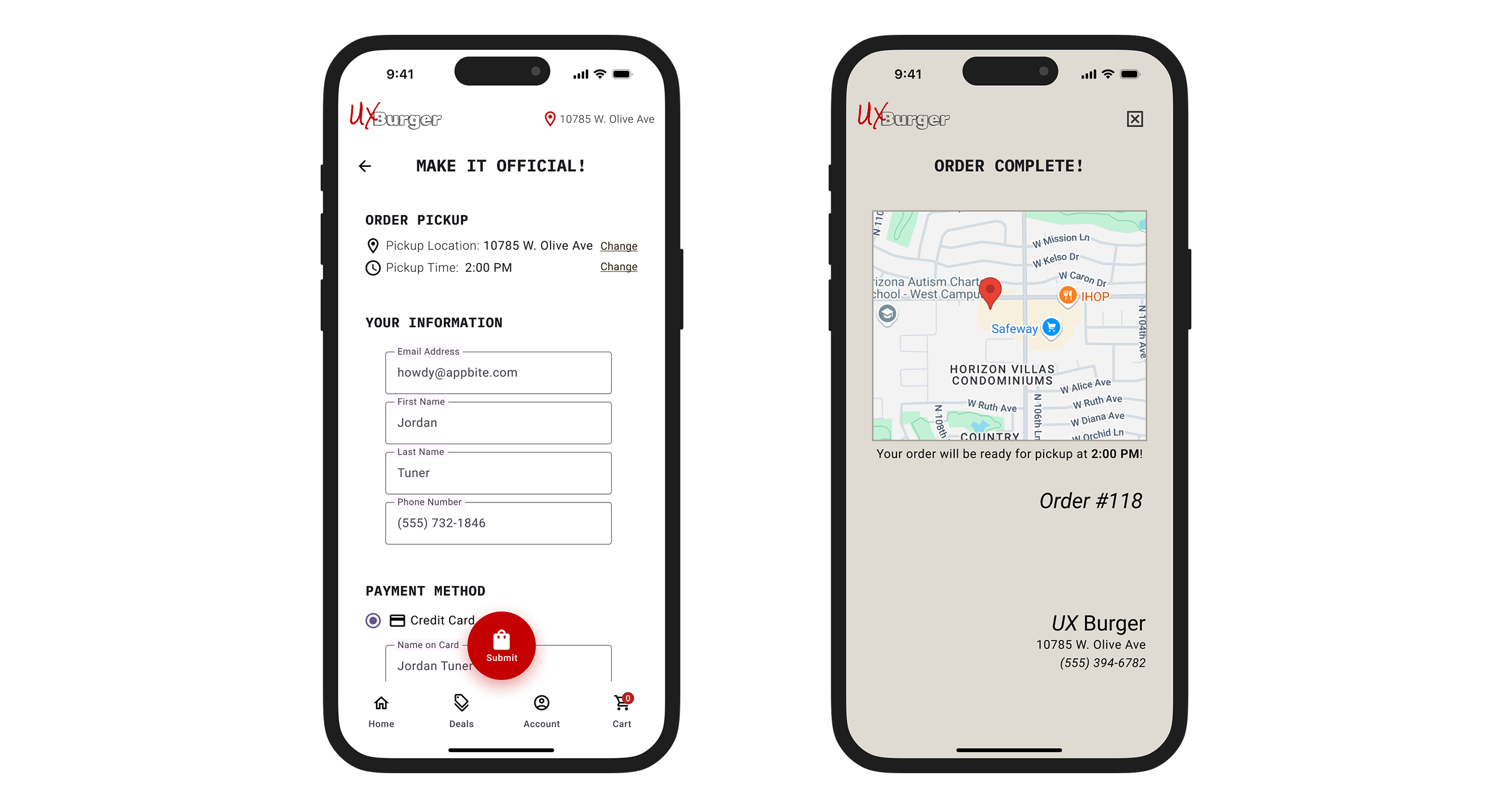
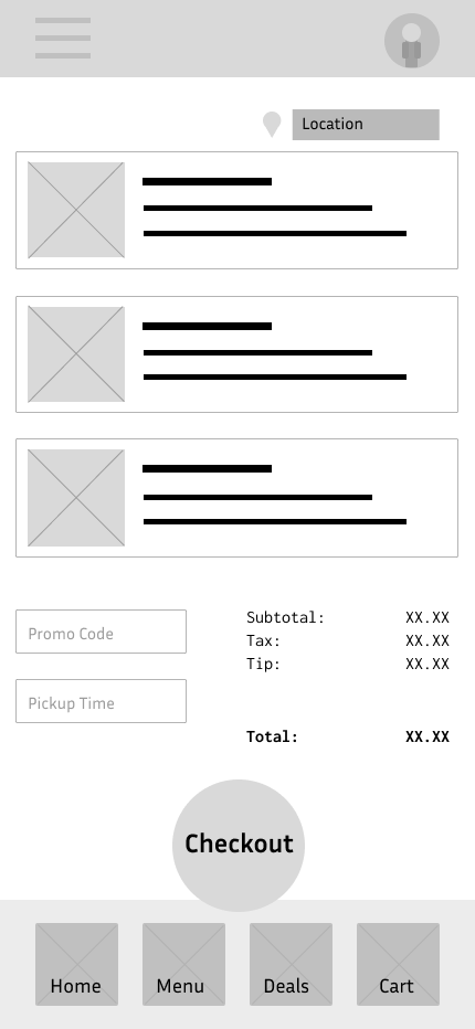
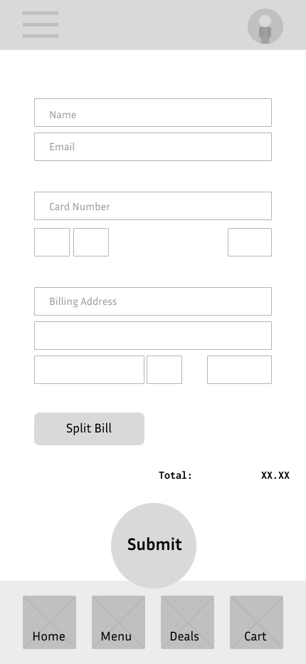
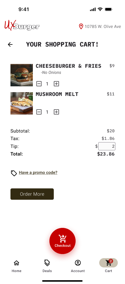
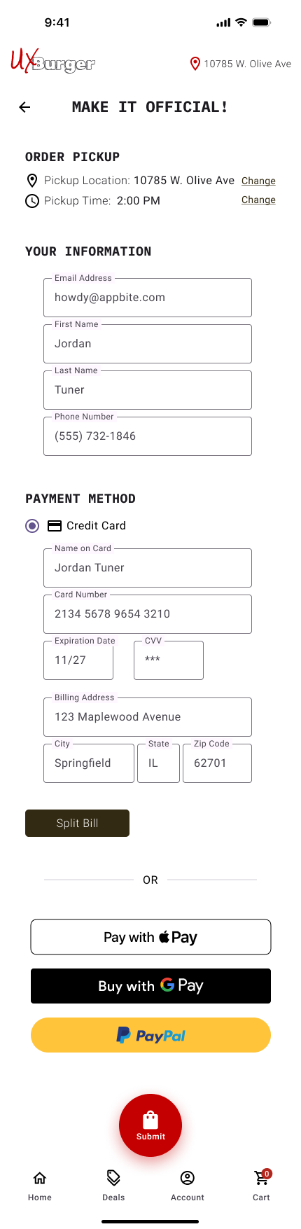
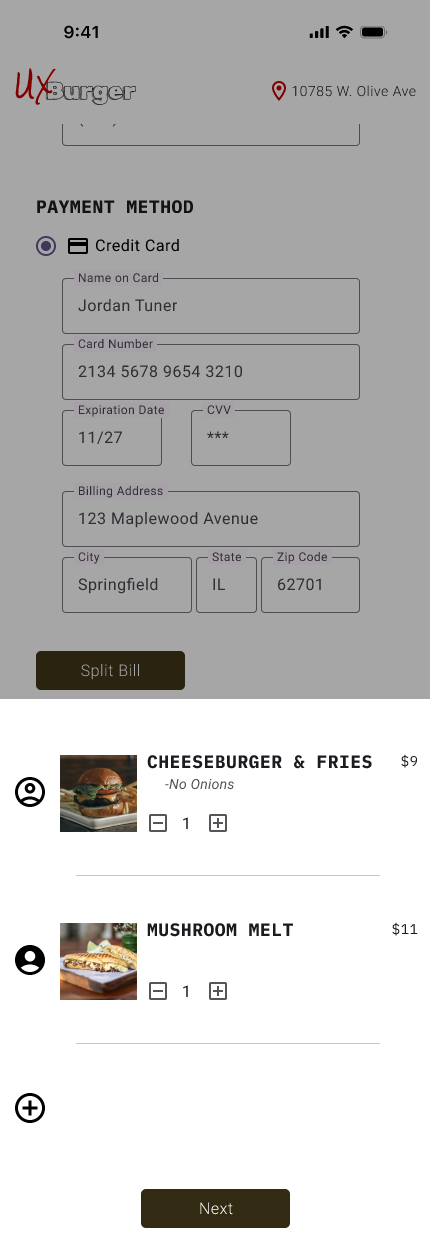
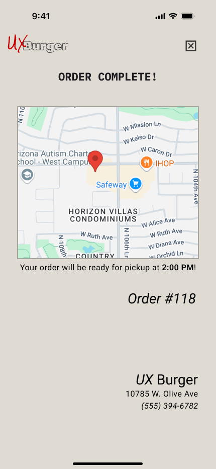
The checkout screen allows users to schedule a pickup time for their takeout order. This allows users with a busy schedule to order ahead of time and pickup when they become available. I’ve also added a split bill option so that users can use multiple forms of payment for a single order.
These are the main features that have been implemented based on our user personas.

After creating a high-fidelity prototype, it was time to conduct another round of testing. I asked users to complete various tasks such as going through the full order process, notating any pain points or technical issues.
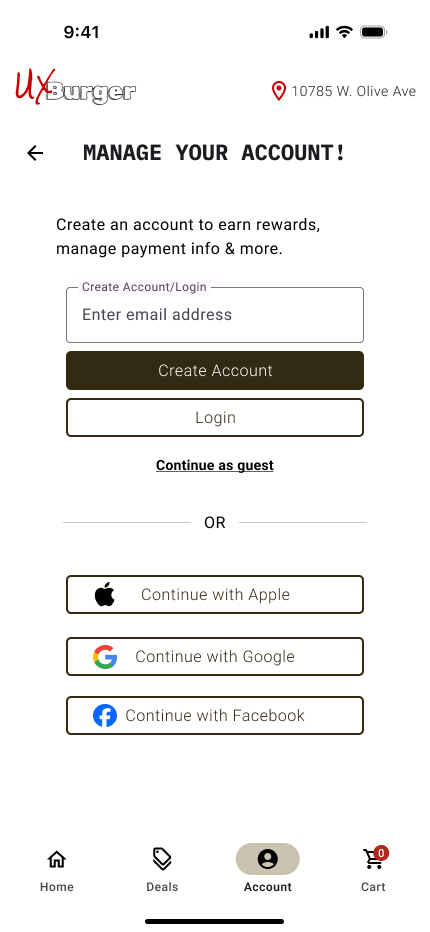
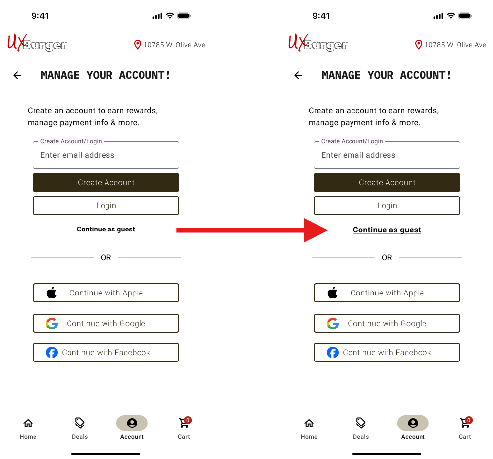
During the testing, I noticed that many users were being held up on the Account screen and it was slowing down their order speed.
The users were asked to select the “Continue as guest” option when going through the order process but none of the users selected this option on the first try. I made the decision to increase the font size of this text so that it will be easier to locate in the future.
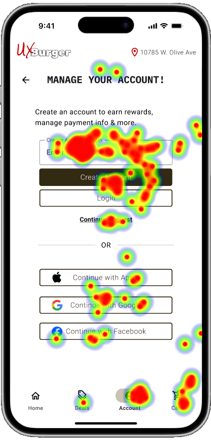
Some users were also having difficulty pressing the ‘+’ icon on the first try. To resolve this issue, I linked the entrée image to the Item Detail overlay instead of just the icon which should make it easier for users to add items to cart.